Note taking apps

Posted by Unknown Sabtu, 23 Juli 2011 0 komentar
It seems strange to me that my Droid Charge didn't come with a note taking application.  I've been sending myself text messages instead.  Here is a very quick comparison of 3 popular note taking apps across several devices.

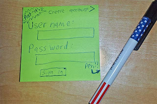
1. Post-it notes

I'll start with the most popular note taking application ever: the post-it note + a pen.  Prerequisite: knowing how to write.  Beyond that, learning curve = zero.
Now, lets see how that compares to the electronic versions...

2. Apple iPhone notes

The Apple notes application is exactly what I expected and wanted.  Prerequisite: knowing how to type.  Beyond that, learning curve = zero.  It is an electronic notepad.  This is what you see when you open it the first time:
And this is what you see once you click the '+' button and start typing:
The first line is automatically the title.  You can go back one step and get a list of notes.

3. Evernote

This is the first post-it note application I tried for Android.  It is highly rated and has lots of features.  So here is what you see when you open it the first time:

*facepalm*

So for this application - Prerequisite: internet access to create an account, time to pick a user name and password and remember them + knowing how to type.  Beyond that, learning curve = ???  I'll never find out because I'm not even going to get that far.

That is not a note taking application.  That is a login screen.  Taking notes does not require a login.  I am at the store, I want to write something down, I don't have internet access where I am, and I want to type in "Smoke Detector $20 - ask wife how many we need."  Instead, I need to go find cell service and conjure up a user name and password and agree to some terms of service.  This is nuts.

I'm okay with a configuration setting that lets me enter in a login so that it can synchronize with Google docs.  That's cool.  But this trend with applications requiring logins for no good reason has to end.  Really, what we see here is the end of freeware.  These supposedly "free" apps for your phone are malware in disguise.  People don't create them because "hey, I wanted a cool free note taking app." they write them because "Gee, if I can harvest notes from random people around the world, this guy with a bag of cash will buy them from me for marketing research.  Yaay!"

More apps leak data than people think.
I'll try another app. :-(

Baca Selengkapnya ....

Android battery life meter

Posted by Unknown Jumat, 22 Juli 2011 0 komentar
Android has a really cool, very detailed battery life indicator.  As a software engineer, I have no idea how it is even possible to do this, so I question the accuracy.  Charting CPU use is just not enough to really do this.

To see it, press the settings button then select Settings - About phone - Battery use.  Screenshot below:

Baca Selengkapnya ....

Battery Life Problem: Part 2

Posted by Unknown Kamis, 21 Juli 2011 0 komentar
This is a follow-up to Battery Life Problem: Part 1.

After uninstalling Fring and rebooting, the battery life today seems good... a little too good.  Take a look at this screen shot:


How is my battery at full power at 5pm?  So I look at the system status screen (Settings - About phone - System Status) and the discrepancy becomes clear:


Aha!!  The battery indicator shows full, but the battery status screen shows 81%.  So the battery meter at the top is stuck.  A Google search reveals that I am not the only one to have this problem.  A forum post suggested I restart my phone, and while it didn't fix the problem immediately the next time I checked (15 minutes later perhaps?) the battery meter was working again.

Arrgh!  Another failure of the most simplistic functionality.  Ironically, I got the Droid Charge because the HTC Thunderbolt was considered "buggy."

I'll try reinstalling Fring and see if that is what killed the battery life.

Baca Selengkapnya ....

Battery Life Problem: Part 1

Posted by Unknown Selasa, 19 Juli 2011 0 komentar
Update: See part 2 of my battery life saga here.

Yesterday my phone's battery life suddenly dropped from about 30 standby hours to about 4 standby hours.

According to the nifty meter that tracks what is using battery life (how do they do that!?!?!?), the display was using 60% of it - even though it was locked the entire time.  Reducing the screen brightness was ineffective.  It just kept draining and draining.  Today, the phone made it to about 3pm and was at 18%.  This time it said WiFi was the culprit, despite not being in a WiFi area and not using the phone at all (up until the point that I noticed the battery issue).  I tried stopping applications, disabling WiFi and BlueTooth, but no good

I installed Fring about 3 days ago, and have not used it.  The phone claimed that Fring used 3% so that isn't the culprit either.  Assuming I trust the meter which I no longer do.

Lots of people have complained about battery life isssues, so this begins my search for the cause.  First two step: uninstall Fring, reboot the phone.  I'll update this entry as the experiment begins...

Baca Selengkapnya ....

Samsung bloatware

Posted by Unknown 0 komentar
Here is an example of some bloatware that came on my Samsung Droid Charge:

The application is "City ID" and notice that it cannot be stopped, uninstalled, or otherwise manipulated in any way.  This alone makes me want to unlock my phone.

This programs job is to periodically get in your way by asking if you want to pay a fee to lookup the area code of a call if the caller is not in your address book.  That is not a terrible idea, but you can do this for free by entering the area code into Google.  Now, it would certainly be nice to have it do this automatically for you, but it is not worth paying for.  And it certainly shouldn't pop-up when you get a call and ask you to pay.

I wonder how many people bought this program just to get it out of the way when they receive calls.  This is a pretty classic example of OEM malware.  Write a program that gets in the way then charge you to get rid of it.  Thumbs down to Samsung and thumbs up to Apple.

Baca Selengkapnya ....

The calendar reminders are just wrong

Posted by Unknown Senin, 18 Juli 2011 0 komentar
I love the reminder options on my Android phone.  I would love them more if they worked.  My phone sends me reminders at seemingly random times.  Here is one example:


At 11:53 on the 13th, I get a reminder about Artscape.  It tells me that Artscape is Thursday the 14 through Sunday the 17th.  Oops!  That should be Fri 15th through Sunday the 17th.  Did I enter it wrong?

Nope, I didn't enter that it was on Thursday the 14th.  So what is on the 15th?

There it is, on Friday 15th. So what happened?

And here are the details which confirm it entered as Friday the 15th.  So why did it remind me a full two days ahead of time, and why does the date range on the reminder screen show something different from the calendar screen?  Surely I am not the first person to ever actually use the reminder feature?  How can QA miss something like this?
Also, the details screen looks odd.  First we see the event name and date range.  Then we see my name and the text "D - 2" then the next attendee with a question mark.  There is no heading that says "Attendees" like how it says "Alarm" and no indication as to what the question mark means.  Clicking on it does nothing.  Does anyone know what that icon is for?

Baca Selengkapnya ....

Android browser options: some good, some bad

Posted by Unknown Sabtu, 16 Juli 2011 0 komentar
Take a look at some of the options for the Android browser. 


It makes no sense to have "change brightness" as one of the shortcuts in the browser.  That is an option that applies to the entire phone, not just the browser, and it is something you set once in the main settings.  The most important menu option for a browser would be bookmarks, which is buried on another screen.


This is what you get if you click the "More" button:
Awesomeness:
  1. "Find on page"  is an option I use constantly on a real web browser but it is not available on the iPhone.  I saw some poorly rated apps in the iPhone app store to do this, but having it built-in is really great.
  2.  "Downloads" is a real win for Android.  iPhones don't let you download files or save them, which is just horrific.  Just yesterday a coworker's wife asks "Can I use my iPhone as a flash drive?"  Nope! Only Apple-approved files on your device!
Sadness: Still no bookmarks???  Huh??  It turns out you get to bookmarks by the unintuitive process of holding down the refresh button for 3 seconds:
Once you get there, the screen is actually nicely laid out.  You can switch to a list view, add folders, etc.  This is really nice.

I'll spend another entry talking about the browser settings.

Baca Selengkapnya ....

Volume

Posted by Unknown Kamis, 07 Juli 2011 0 komentar
The phone only understands one call volume which applies to the earpiece, bluetooth, and speakerphone.  This is silly.  The iPhone remembers each of these volumes independently.  With my Android phone, every time I hit the Speakerphone button I have to crank the volume up, then crank it back down when I switch back.

I think even my old flip-phone supported this.

Baca Selengkapnya ....

Viewing pictures taken with your Android phone

Posted by Unknown Rabu, 06 Juli 2011 0 komentar
Camera phones take pictures.  You should be able to view those pictures too.  For some reason this basic functionality is limited on my Samsung Droid Charge.  So far I found 2 photo viewers on the phone.  One good, one less good.


Camera Photo Viewer:
If you click the camera icon you can go into review mode by clicking on the picture in the corner.  This is just like on the iPhone and is fairly intuitive.  Regular digital cameras usually do this with a switch.

This viewer is brain-dead.  First, it doesn't rotate the pictures when you rotate the camera.  That is basic functionality as of about 5 years ago.  Second, if you swipe the image left or right it does move to the next picture, but it doesn't show any swiping animation.  This is the first gesture system I've ever seen where there is no feedback.  It is quite jarring to use.  Even games back in 2001 did this. 


My Files viewer:
If you hunt around under "Apps" you will find an "App" called "My files".  This is a good photo viewer with a few odd quirks.  You can use this to view your pictures by going under the "DCIM\Camera" folder.  It does rotate pictures, and it does let you swipe.

From a technical perspective the folder layout is great - the DCIM folder is exactly the place most digital cameras place their files.  But most people don't know that and won't ever find their pictures which is a shame since this is the better photo viewer.  They need to make an icon that says "Pictures" that just takes you to this folder in one click.

The other issue is the order of the pictures.  Below is the list of my photos, nicely named and sorted with thumbnails.  That's great.

Suppose I click on the 3rd from the bottom, "2011-07-04 19.13.00.jpg" which was an experiment with the "Action Shot" mode.  We can see that the picture says it is 1 of 55.  But that was in the middle of the list, so it shouldn't be picture number 1.  But maybe the first picture you click on is always picture 1.  That's okay.

So I swipe the picture off the left side, and I get:
The wrong picture!  This isn't the next picture in the list.  It is the first file in the folder, and it isn't even close to the one we were just looked at.  It turns out that the picture you click on is number 1, and thereafter they start from the beginning.  This means that if I have 100 pictures on my camera, and I want to show someone the last 5 pictures I took, I have to swipe 95 times to get to them.  Or I have to click on the photo, then hit back, then click on the next phone.  Both options are retarded.

The file viewer app is the killer app for this phone.  It views every kind of file I can find, and unlike my iPhone I can copy files to/from it, including email attachments.  But the photo viewers are basic functionality for a camera phone and there are quite buggy.  Here are some more screen shots of the "My files" app:

Swiping works as expected:
 Camera app, with the "review" icon in the lower right corner:
"MY files" thumbnail and gallery options:

Baca Selengkapnya ....

Size matters

Posted by Unknown Minggu, 03 Juli 2011 0 komentar
One problem with the Droid Charge is that it is too large to fit in women's pant pockets.  In general, men's jeans have deeper pockets.  The phone is large enough that my coworkers keep asking me about my new laptop, and if I need a bag to carry it around.

That's it: my next phone is going to be twice as big.

Baca Selengkapnya ....

Yaaaay! Voice text messages! Voice *everything*

Posted by Unknown Sabtu, 02 Juli 2011 0 komentar
2 of my favorite iPhone features are voice dialing and Google's voice search.  Android has taken voice recognition to a new level, although the voice dialing has a nearly fatal flaw.


For 2 years, every day I left the office I grabbed my iPhone, and without looking held down the home button and said "Call Jessilem."  Please wipe that silly look off your face, you know you have stranger pet names for your wife than that.  Anyway, my iPhone would dutifully reply "Calling Jessalam, mobile" which was close enough.  Now, once every six months it would say "Calling Justin, mobile" at which point I would have an awkward conversation with an acquaintance trying to pretend I was thinking of him and just wanted to see what was up. :-)

In the wonderful world of Android, every day I leave the office and I grab my Android phone and click the unlock power button, wait a moment, unlock it, click home, wait a moment, touch the voice dialing icon, and say "Call Jessilem on cell."  Then I wait for a moment and look down and realize it takes about a second or two before it actually starts recording.  My Android phone then dutifully displays "Call Dad on cell."  I cancel that and repeat "Call Jessilem on cell." It displays the message, then I click okay, then it dials.

The Android developers got the easy part right: the voice recognition algorithm is just fine.  But they got the whole user interface wrong.  Lets see what they missed.

  • Hands-free
First of all, voice dialing  is a hands-free operation.  Apple got this by triggering voice dialing by holding in the one and only button on the phone.  Picture this: explosions.  aliens.  phaser fire.  Commander Riker grabs his communicator, removes it, presses a button on the back, slides his finger along the symbol of the United Federation of Planets logo, then says "Riker to Captain Picard!  Two to beam up, NOW!"  His communicator then displays a message asking him to confirm it.  Before he can click the button, his head is melted by the Borg he didn't see behind him.
  • Audio queues
On both phones, there is a brief delay before the voice recognition starts.  The iPhone plays a little "doo-doot" sound when it is ready for you to speak.  The droid does not.  If you watch the display it says  "Starting Up" then "Listening" before it starts to record.  The iPhone also gives you audible confirmation that it recognized the command and it audibly tells you what it is about to do.  No looking at the screen, no timing, no guesswork.
  • No confirmation required

The iPhone just makes the call.  There is plenty of time to grab your phone and cancel it.  Audio cancellation would be even better though.  And if the iPhone is unsure it asks for clarification.  "Call Jessilem: home, or mobile?"  (Most voice recognition algorithms know how close they were to a match).  The Android phone requires confirmation even if it got it 100% right, and the confirmation require you to look at the phone.  Of course, you already had to look at the phone to even use the feature.


I assume there are 3rd-party voice recognition apps out there.  I home some of them monitor the power button and wake without requiring screen interaction.  I can imagine other compromises: perhaps another puzzle piece on the unlock screen, one that indicates a desire to make a voice call.  I haven't looked yet.  Does anyone have suggestions for a better app?

FUTURE: I'll talk about how Android voice recognition rocks in another post.

Baca Selengkapnya ....

Conversation view

Posted by Unknown Jumat, 01 Juli 2011 0 komentar
One horrible misfeature of the iPhone is that the iPhone does not always show the date and time of text messages.  It seems like if the messages are close enough together it groups them as part of a conversation, and it only displays the time stamp of the first one.  This has been a problem for years and is a constant unaddressed complaint. 

While this does save a bit of screen space, it is frustrating when someone replies with "I'm running behind, if you don't see me in 15 minutes just go ahead without me." and you didn't notice the message right away.  Apple deserves a smack-in-the-back-of-the-head for this one.

Fortunately, this is resolved on Android.  Every message shows the time stamp.  Comparison shots below.


(iPhone screen shot courtesy of tyler ingram's blog)

Baca Selengkapnya ....
Trik SEO Terbaru support Online Shop Baju Wanita - Original design by Bamz | Copyright of android blackberry.